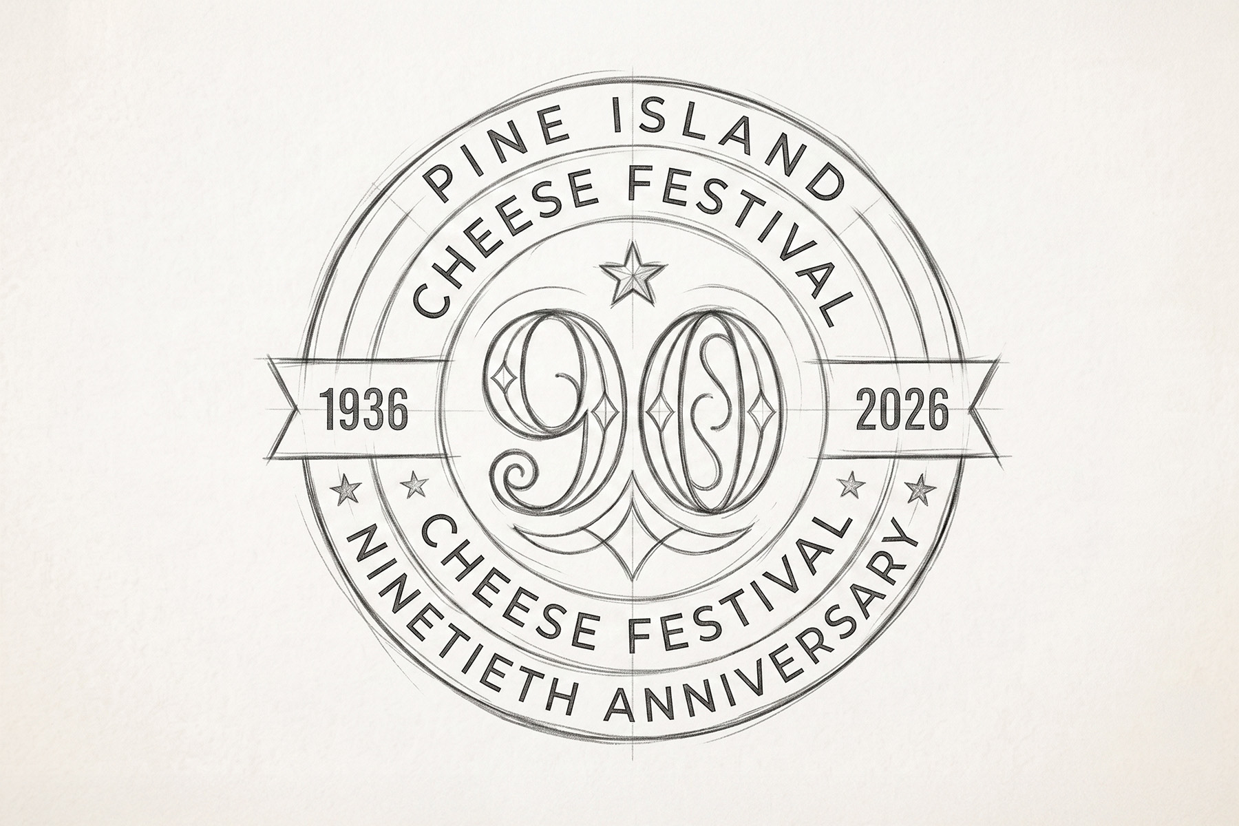
We started by brainstorming key ideas that reflected the festival's history and vision. Several elements were inspired from the existing brand logo, such as the line art style, stars, and sans-serif type.
It was important to highlight the "Year Range," show "90" years, and include a ribbon feature.
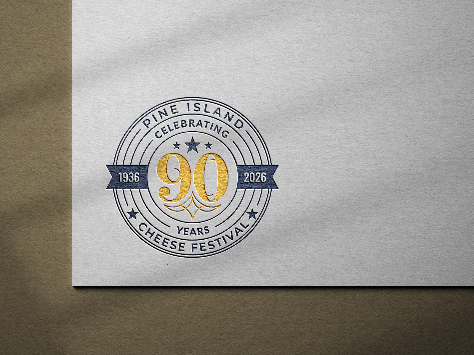
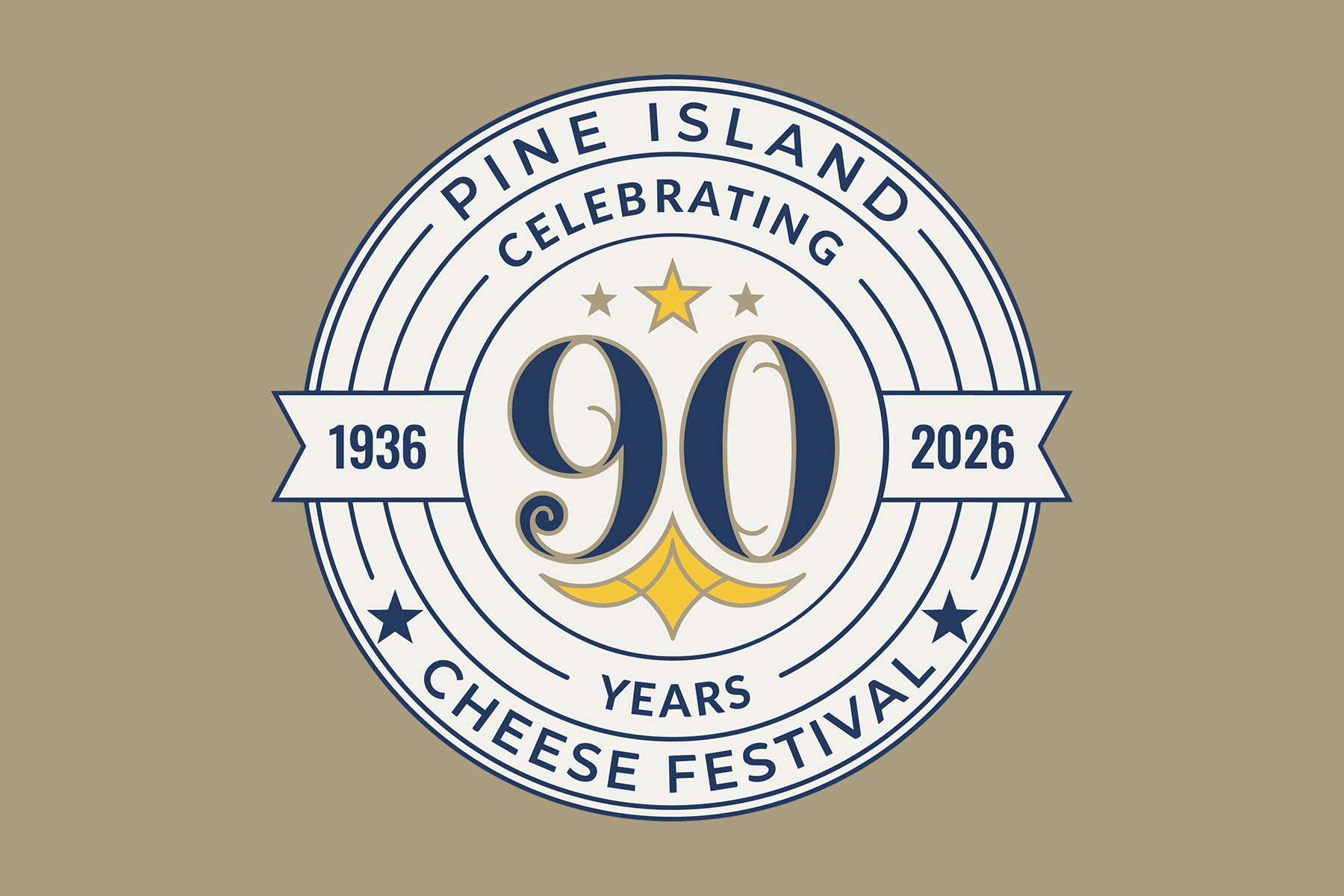
The circular badge design was chosen as the strongest visual concept.
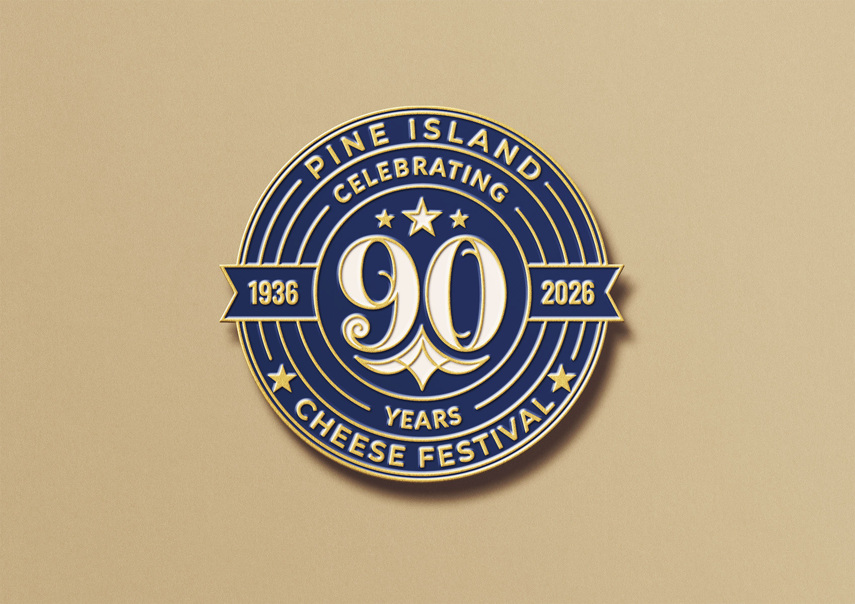
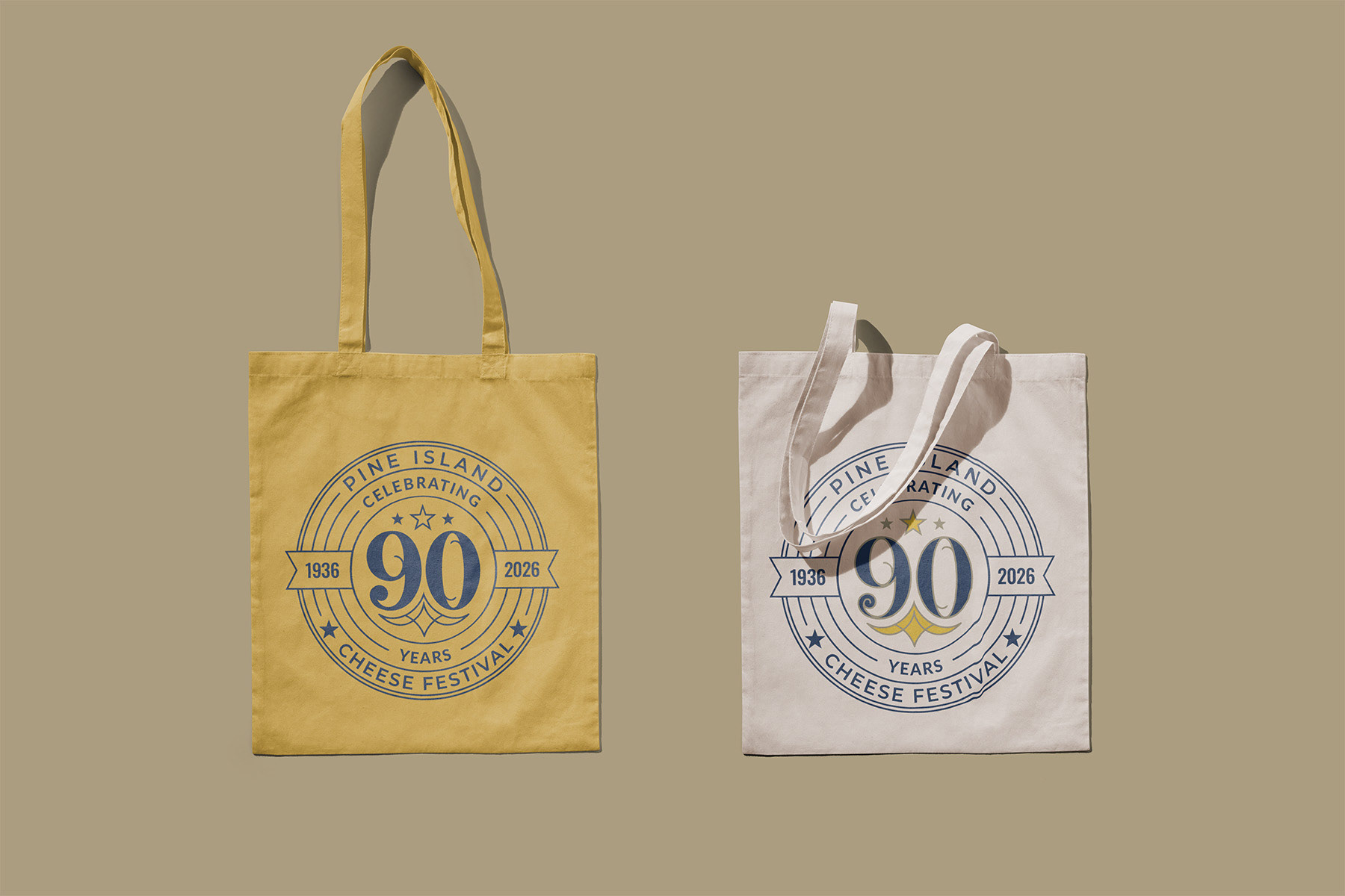
The final design of the primary brand mark is a vibrant, circular badge featuring concentric rings that echo the spin of a Ferris wheel. The eye is drawn to a bold, intricate "90," which is bisected by a ribbon displaying the heritage dates (1936–2026) and crowned with a triad of stars.
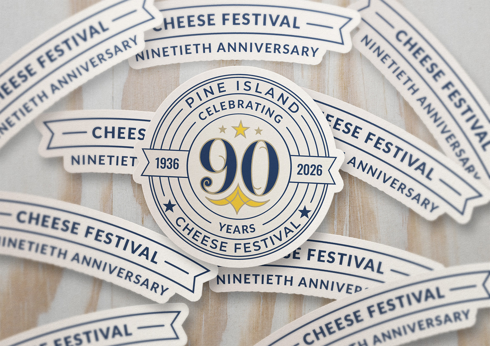
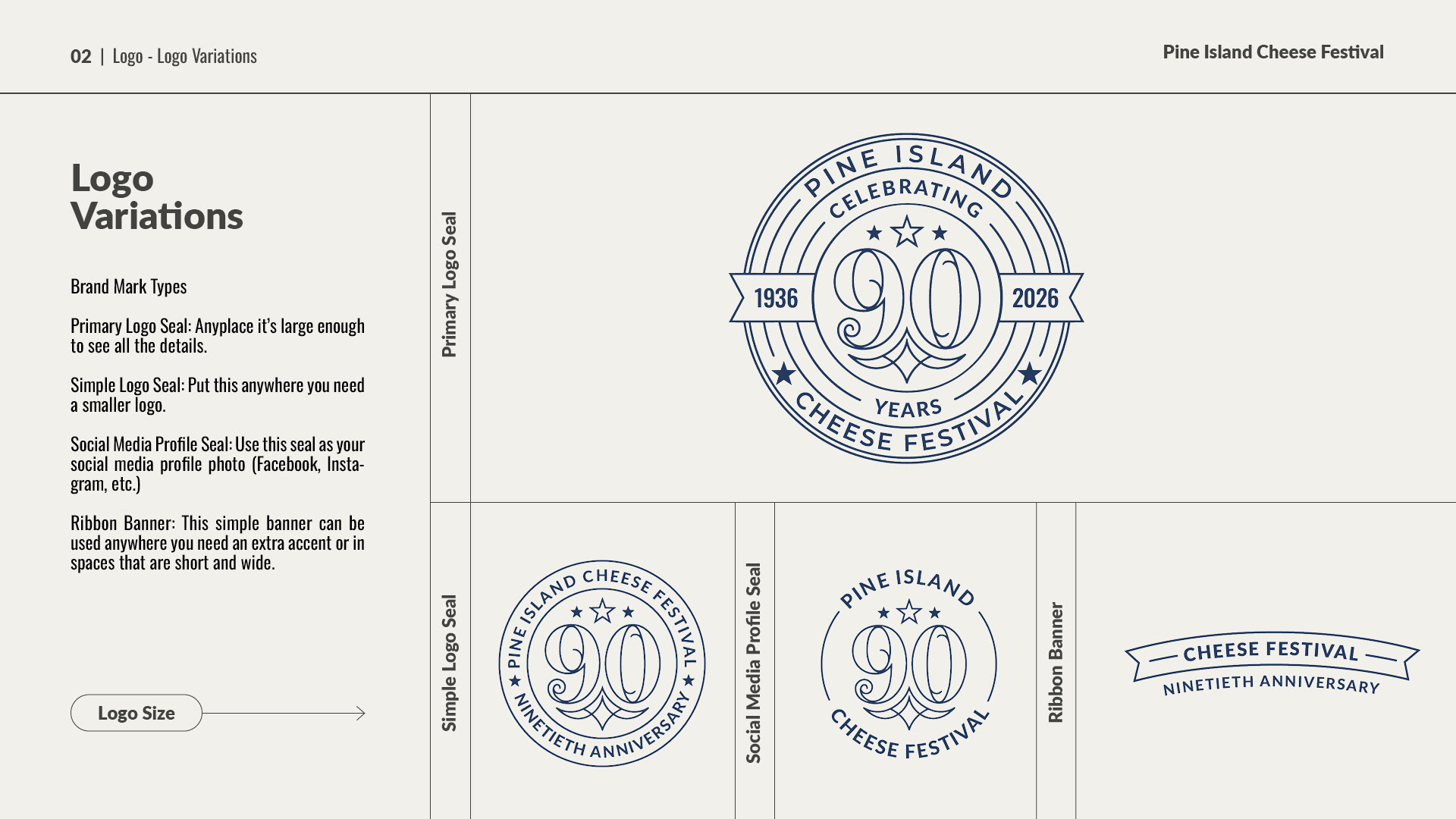
The final brand mark was designed in multiple variations, ensuring it would be versatile and effective across all digital and physical platforms.
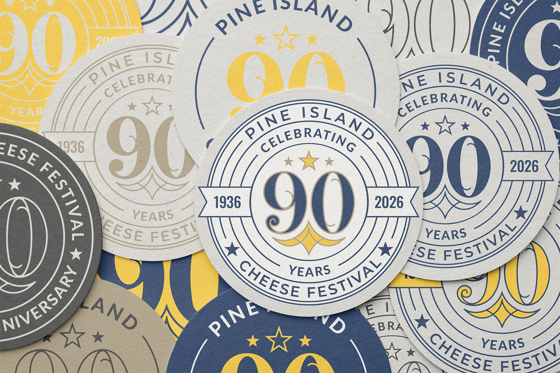
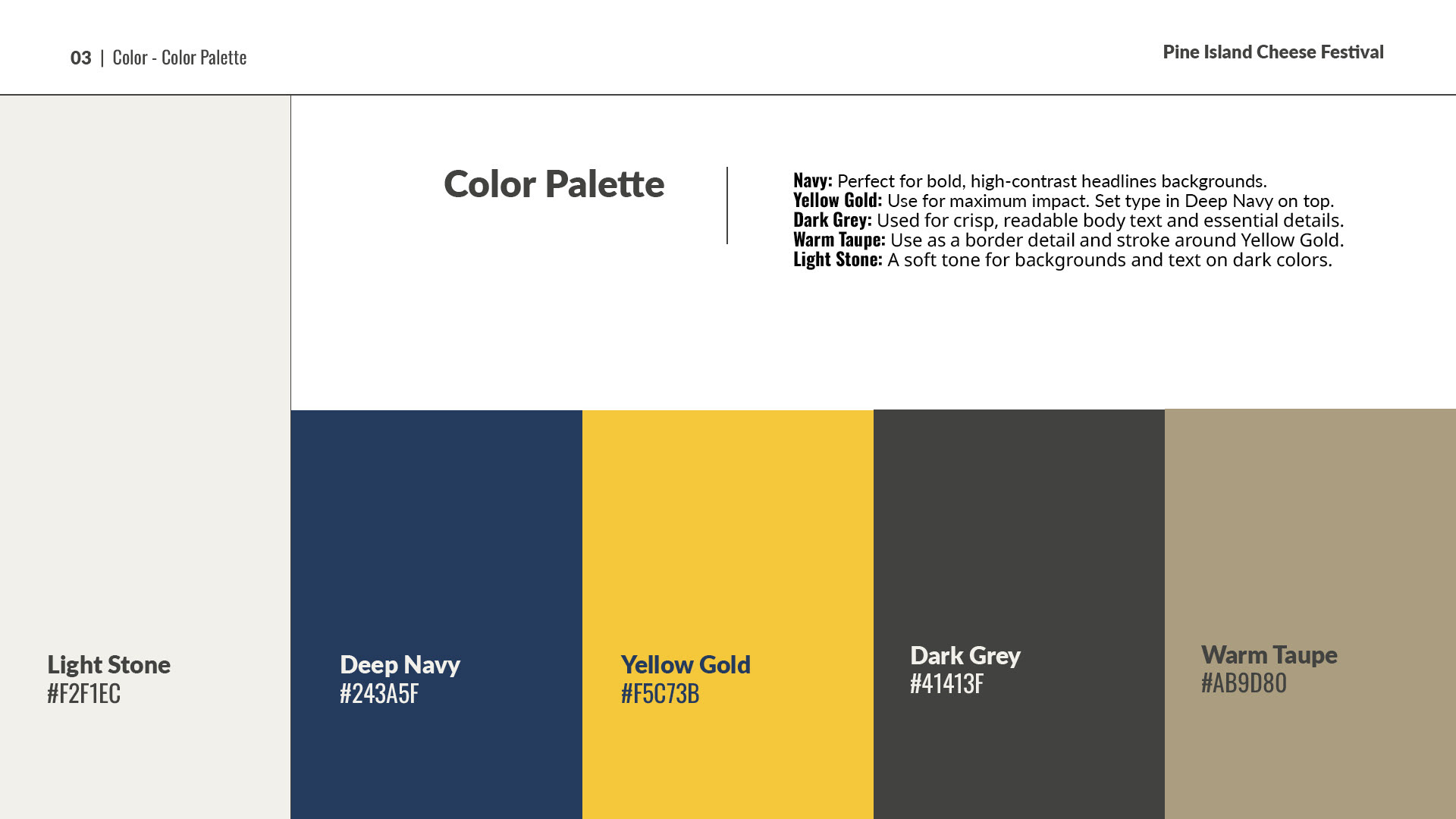
We developed a palette that captures the vibrant transition from a sunny afternoon to an electric evening. It features Deep Navy and Yellow Gold for maximum impact, supported by Dark Grey, Warm Taupe, and Light Stone for readability and clean contrast.
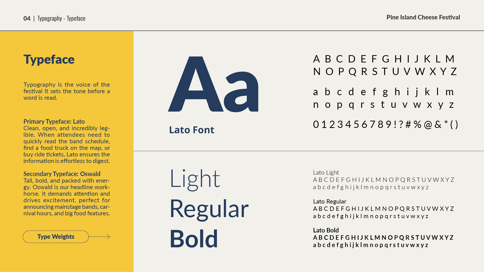
The typographic voice strikes a balance between clarity and excitement. We utilized Lato as the primary typeface for clean, open legibility, while Oswald serves as the secondary typeface, providing tall, bold energy for mainstage headlines.
Log Usage Examples